Five Killer Infographics We Return to Again and Again

Who doesn’t love a great infographic? A smart graphic brings data and facts to life, making them not just illuminating, but inspirational to take action.
Here are five killer infographics we find ourselves coming back to repeatedly. They demonstrate the relationship between energy and economic development, how African countries can actually benefit from the current rush for their critical minerals, how green grids are really hydro, and how the US government is making life painful for nuclear tech firms.
The Fridge
The Hub literally started with an infographic. That’s how much we love them!
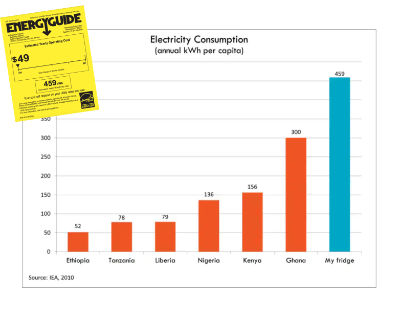
When Todd Moss bought a new refrigerator in 2013, he noticed his typical single-family American fridge would use more electricity than most people living in Africa use in a whole year. He created a simple graphic that went viral because of how starkly it illustrated global energy poverty.
Learn about The Fridge’s impact.
The Empty Quadrant
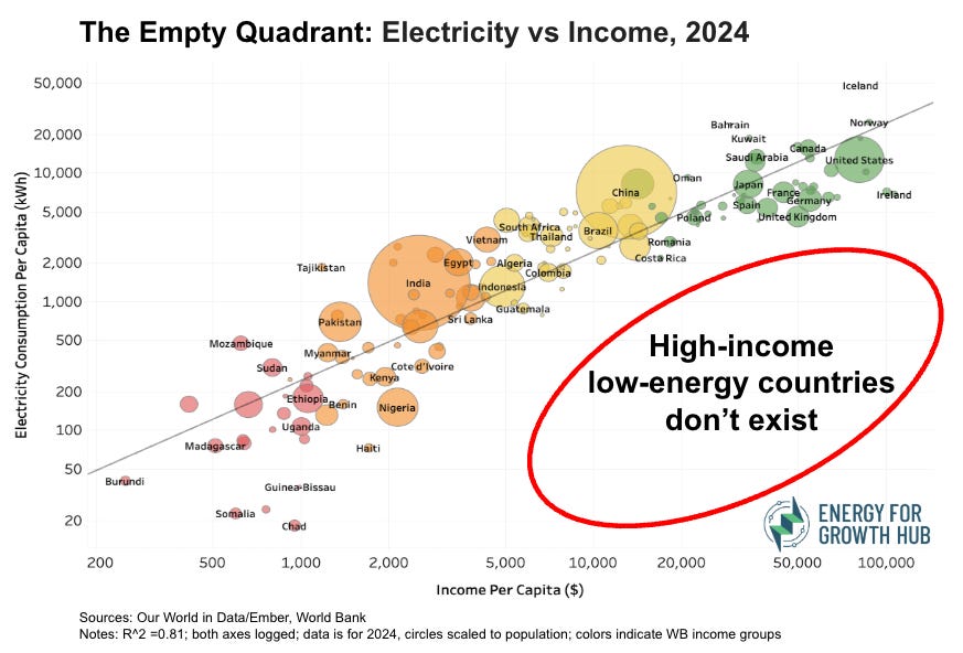
This analysis underpins everything we do at the Hub. There are no high-income countries without high energy consumption, period. The trend holds across all regions and all years. The bottom line: economic growth depends on having enough reliable, affordable energy.
We just renamed this chart ‘The Empty Quadrant’ to call attention to the bottom right of the graph. That’s where high-income, low-energy countries would be if they existed. They don’t.
Read more about the latest update or check out the interactive graphic.
The Rings of Growth
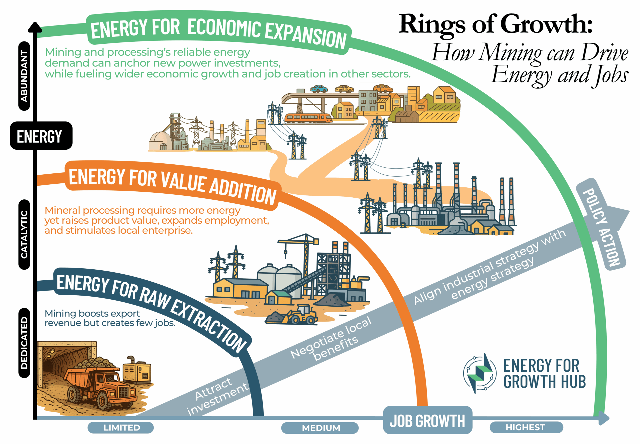
Governments and companies are scouring Africa to secure minerals and metals. They care about their own national security and supply chain diversity. New deals must, of course, also benefit Africa. But here’s the catch: many resource-rich African countries are still stuck as extraction cash cows. They risk gaining little from all this attention.
So how will it be different this time? How can Africans turn the surge of minerals interest into broader, lasting economic benefits? The short answer: energy.
Here are three Rings of Growth that show how mining can drive long-lasting energy and jobs:
Dammed and Dismissed
Despite expanding solar and wind energy use, hydropower is still by far the world’s largest source of renewable energy and the biggest contributor to clean grids.
In 57 countries, renewable energy makes up more than half of electricity generation. In 48 of those countries, hydropower contributes 40% or more to their power supply. For regions like Africa, where it remains under-tapped, the lack of recognition hides hydropower’s role and skews policy and investment decisions.
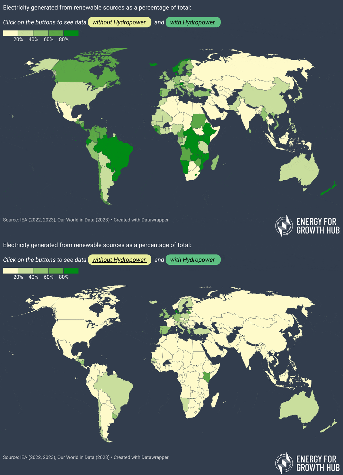
Check out the interactive version of the map. And read why this data matters in decision making.
The Nuclear Export Gauntlet
Many countries are increasingly interested in nuclear as firm, clean power. And novel small modular reactors could be the right size for many emerging economies.
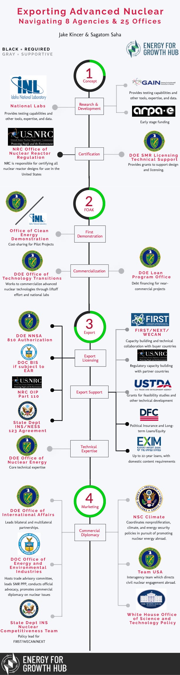
The United States is one of three top suppliers of nuclear technology, and is competing with the other two, China and Russia, for influence and market share. Yet any US nuclear company eager to export their reactors must run a complex gauntlet of government offices and regulatory approvals.
We mapped out exactly what it takes: 25 offices across 8 federal agencies.